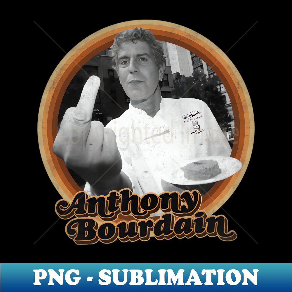
The visual grammar established by Bourdain and the artists he collaborated with fundamentally changed how food media looks. Across modern hospitality, hundreds of independent restaurants, food trucks, and craft beverage companies take cues from this aesthetic. They lean on raw stencil typography, hand-printed merchandise, raw butcher-block photography, and handwritten menus.
Before Bourdain's emergence, culinary visual branding was dominated by three narrow categories: the sterile corporate white-plate look, rustic country-kitchen pastels, or traditional European heraldic crests. Bourdain helped introduce a working-class downtown aesthetic to mainstream culture. He made frayed typography, rough paper stocks, and unstaged photography look authentic.
Today, the Bourdain visual legacy endures because it was never treated as a commercial licensing tool. His family and estate have consistently avoided slapping his name onto cookware lines or retail spice blends. Because the aesthetic was never watered down into a cheap supermarket logo, its design cues retain their original, defiant bite.

