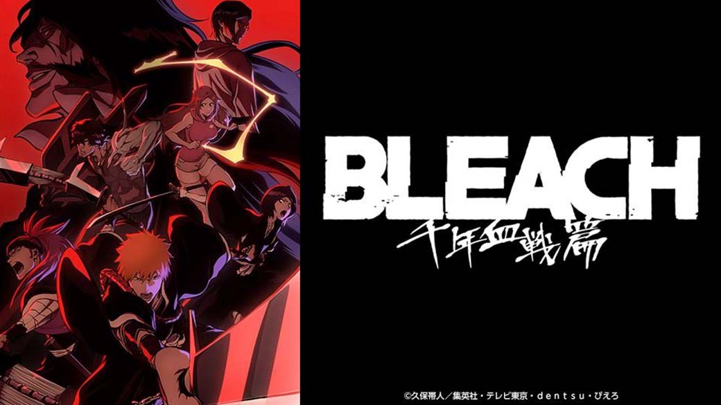
The graphic language established across Kubo's covers and chapter splashes reshaped visual expectations across the manga industry. Contemporary creators routinely cite his sense of style as formative. Gege Akutami’s handling of negative space and wardrobe design in Jujutsu Kaisen directly reflects Kubo’s urban editorial approach. Similarly, the stark cover concepts seen in recent dark fantasy manga lean heavily on the "single figure against white" formula pioneered in Bleach.
Outside Japan, Kubo’s design legacy thrives in digital art and streetwear cultures. Fashion designers and graphic illustrators frequently analyze his title spreads for their mastery of typographic hierarchy. The title drop in "Wrath as a Lightning" demonstrated that mainstream animation can integrate high-end editorial graphic design directly into dramatic narratives without breaking immersive tension.

